
When developing a modern website, we need layouting techniques with features provided by CSS, namely Grid. By using CSS Grid, we can easily create layouts on websites. Grid layout provides control to create complex and responsive web designs with ease. In this article, we will discuss CSS Grid in depth and understand it with practical examples that are easy to understand for beginners.
What is CSS Grid Layout?
CSS Grid Layout is a two-dimensional layout system that allows us to arrange elements in HTML in rows and columns simultaneously. Unlike Flexbox, which works in one dimension, CSS Grid provides full control over both the horizontal and vertical axes. Using Grid Layout for layouting allows us to:
- Create complex layouts easily.
- Create responsive designs without complex media queries.
- Overcome the limitations of using floats and positioning in CSS.
Basic Concepts of CSS Grid
Container elements defined as grids need to be declared with the property display: grid;.
.grid_container {
 display: grid;
}
The container element with the class .grid_container is defined as a Grid Container.
Main Properties in CSS Grid
Some main properties that are important after we define the Grid Container are grid-template-columns, grid-template-rows, grid-area, and gap. The functions of these two properties are explained as follows:
grid-template-columnssets the number and size of columns in the grid container.grid-template-rowssets the number and size of rows in the grid container.grid-areadetermines the position of elements in the grid based on rows and columns.gapsets the spacing between columns and rows. Here's a simple layout example using CSS Grid. HTML Code
<!DOCTYPE>
<html>
	<head>
		<title>Learn CSS Grid - NganggurDev</title>
	 <link rel="stylesheet" href="styles.css"/>
	</head>
	<body>
	 <div class="grid-container">
			<div class="header">Header</div>
			<div class="sidebar">Sidebar</div>
			<div class="main">Main Content</div>
			<div class="footer">Footer</div>
		</div>
	</body>
</html>
CSS Code
.grid-container {
  height: 100vh;
  display: grid;
  grid-template-areas:
    "header header"
    "sidebar main"
    "footer footer";
  grid-template-columns: 1fr 3fr;
  grid-template-rows: auto 1fr auto;
  gap: 10px;
}

.header {
  grid-area: header;
  background-color: aquamarine;
  padding: 10px;
  text-align: center;
}
.sidebar {
  grid-area: sidebar;
  background-color: lightblue;
  padding: 10px;
  text-align: center;
}
.main {
  grid-area: main;
  background-color: lightcoral;
  padding: 10px;
 }
.footer {
  grid-area: footer;
  background-color: lightgreen;
  padding: 10px;
  text-align: center;
}
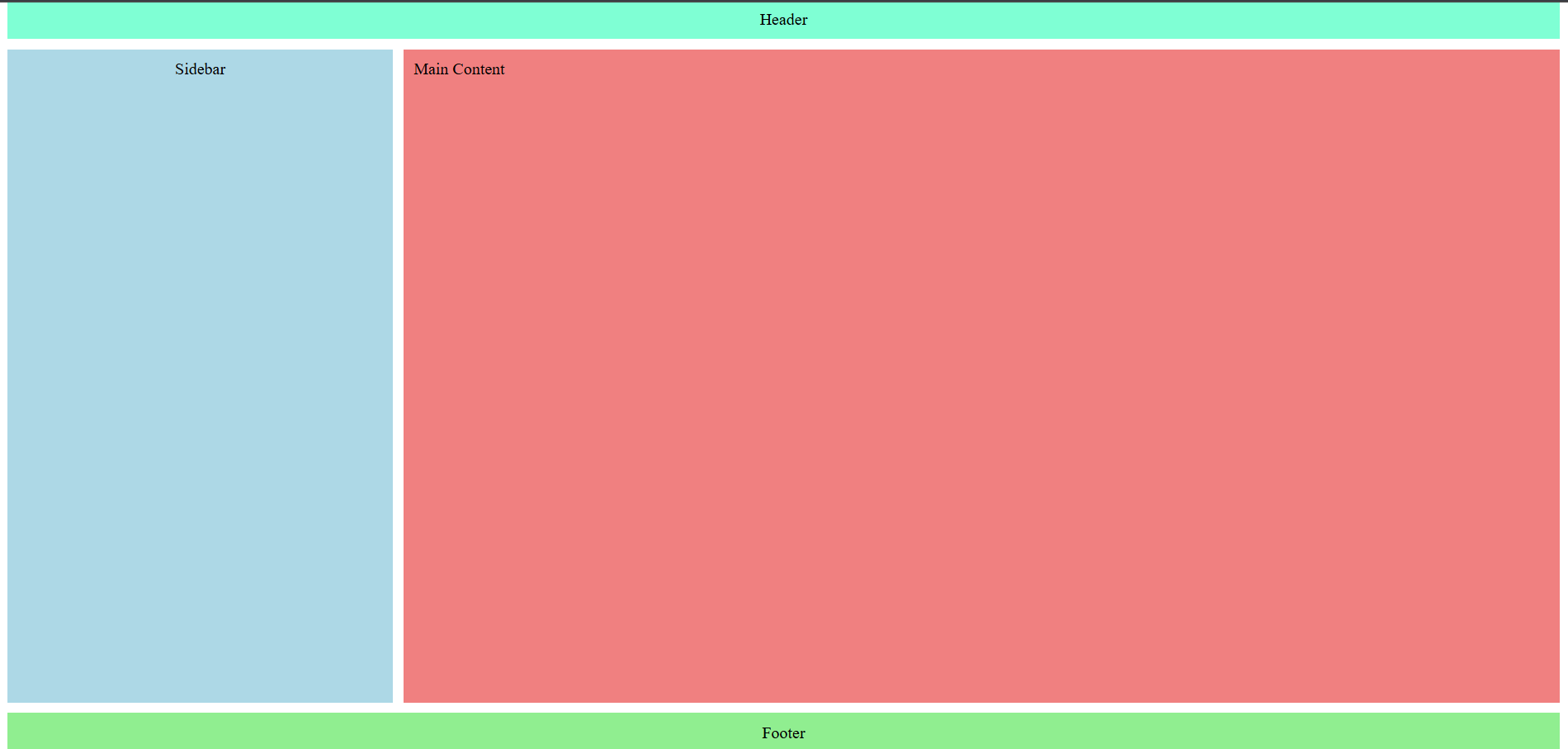
From the code example above, we create a page layout structure with named areas. The layout is divided into three main rows consisting of the header, content (sidebar & main), and footer. Visually, it will look like the image below.
Units in grid-template
In the grid-template-columns and grid-template-rows properties in CSS Grid, we can use various types of units (value) to measure the width of columns and the height of rows. Here are the commonly used units along with their explanations:
pxis a fixed unit that does not change even if the screen size changes.%refers to the width or height of the grid container element.fris a special unit in CSS Grid that divides the remaining space proportionally.autothe width of columns or rows will be automatically adjusted based on the content.
CSS Grid vs Flexbox
In the previous article, we learned about layouting using Flexbox Flexible Box Layout in CSS - Easy and Powerful Responsive Layout. Now, we need to know when to use Grid and when to use Flexbox.
Use Grid when:
- Creating a two-dimensional layout (rows and columns).
- Need precise control over element positioning.
- Creating more complex page layouts.
- Creating responsive designs without relying heavily on media queries.
Use Flexbox when:
- Creating one-dimensional layouts (rows or columns).
- Creating components.
- Need flexibility in item sizes.
Conclusion
CSS Grid is a modern solution for creating complex and responsive page layouts. By learning CSS Grid, we can build more professional website structures.
Thank you, see you in the next article.
